
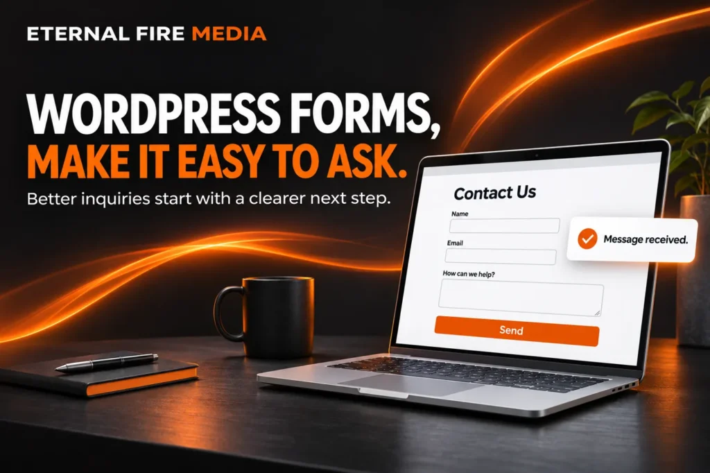

A good WordPress form gives someone a straightforward way to ask for help and gives your business enough information to respond. That sounds simple. But a form can look finished while still asking too much, breaking on a phone, or sending inquiries to an inbox nobody checks.
If you are paying to bring people to your website, the last step deserves attention. Before spending more on traffic, try your own form as a customer. Can you understand it, complete it, and get a clear confirmation without having to figure anything out?
Start with the conversation you want to have
A general contact form and a project inquiry form have different jobs. Someone asking a quick question should not need to write a full project brief. Someone requesting a commercial installation quote may need to tell you the service, location, and rough scope before you can offer a useful answer.
I would start with the information you actually use in your first reply. For many service businesses, that means a name, a way to respond, the service they need, and a short description. A city or ZIP code can help when you serve a specific area. A full street address can often wait until you need it.
Ask whether each required field helps you take the next step. Budget and timing can be useful for substantial projects, but give people an honest way to say they are unsure. You want to qualify a conversation without making a reasonable customer feel unprepared to have it.
Put the right form where the decision happens
Do not assume every visitor will find your contact page. A person reading about one service should have a clear way to inquire about that service. A short form near the end of the page, or a clear button leading to it, can keep that next step connected to what they just read.
For example, a landscaping page about patio installation could ask what kind of outdoor project the visitor has in mind. A bookkeeping page could ask which service the business needs. These are examples of useful context, not a reason to build a different complicated form for every page.
This is part of planning a business website: the content, the button, and the inquiry process should work together. Keep a visible phone option for people who would rather talk, especially when the service may be urgent.
Make the fields easy to understand and use
Use visible labels, make required fields clear, and explain errors next to the field that needs attention. A placeholder inside an empty box should not be the only clue about what belongs there. The W3C forms guidance recommends asking only for necessary information and providing clear labels, instructions, and feedback.
On a phone, I prefer a straightforward single-column layout for most service inquiry forms. Give fields and buttons room, keep text readable, and check that the keyboard does not make the next field difficult to reach. Test the form with a keyboard as well as a mouse. A clean-looking design still needs usable focus indicators and sensible navigation.
Be forgiving about ordinary input. Phone numbers may include spaces or parentheses. If you ask for a website, handle a normal domain such as example.com without forcing the visitor to understand URL formatting. Validate and normalize that information safely behind the scenes rather than making customers troubleshoot it.
Tell people what happens after they press send
A button should describe the action. “Send,” “Request an estimate,” and “Ask about this service” can all work when they match what happens next. Do not call it “Book now” if the person is only sending a request for someone to review.
After submission, show a confirmation people can actually see. Keep it clear of the button and other elements. A simple message might say: “Thanks. We received your request and will contact you using the details you provided.” Add a response window only if your team can reliably meet it. A form submission should not imply that an appointment is confirmed unless it really is.
Check the inbox, not just the success message
A success message is not proof that an email reached you. WordPress itself notes that a successful result from its wp_mail function does not guarantee the recipient received the message.
Send a test inquiry and confirm that it arrives at the intended destination with the right fields. Check the reply address, too. You should be able to respond to the customer without accidentally replying to your own website notification address.
Use a properly configured sending service and review delivery problems when they occur. Where appropriate, store submissions securely as a backup, with access and retention suited to the information collected. A contact form should not invite customers to send passwords, payment details, or sensitive documents through an ordinary message field.
Repeat the full test after changes that could affect the form, email service, or website. This is a practical reason for ongoing website management. A form that worked at launch still needs someone responsible for checking it later.
Choose WordPress form features you will actually use
I like WordPress because the form can grow with the business. You can start with a simple inquiry and, with a suitable form tool, add conditional questions, routing, or a connection to your customer management system when there is a real need.
That flexibility comes with upkeep. Features vary by plugin and license, integrations need testing, and extra complexity creates more things to maintain. Choose a supported tool that fits your process. Do not add three overlapping plugins to solve a problem one well-configured form can handle.
Use spam protection, but test it with real users in mind. A filter that blocks legitimate inquiries is not doing its job. And measure useful outcomes: qualified requests, replies, and work won. A button click alone does not tell you that a form was submitted successfully or that the inquiry was a good fit.
Give your next customer a clear way in
You do not always need a whole new website to improve the inquiry process. Sometimes the work is removing unnecessary fields, fixing delivery, clarifying the next step, or making the mobile layout easier to use.
If you are unsure whether your WordPress forms are helping people reach you, tell me what you want your website to do. We can look at the path from the service page to the inquiry and work out what needs attention.